Another suggestions for the menu
-
Today, as tour guide, I got another idea to improve usability.
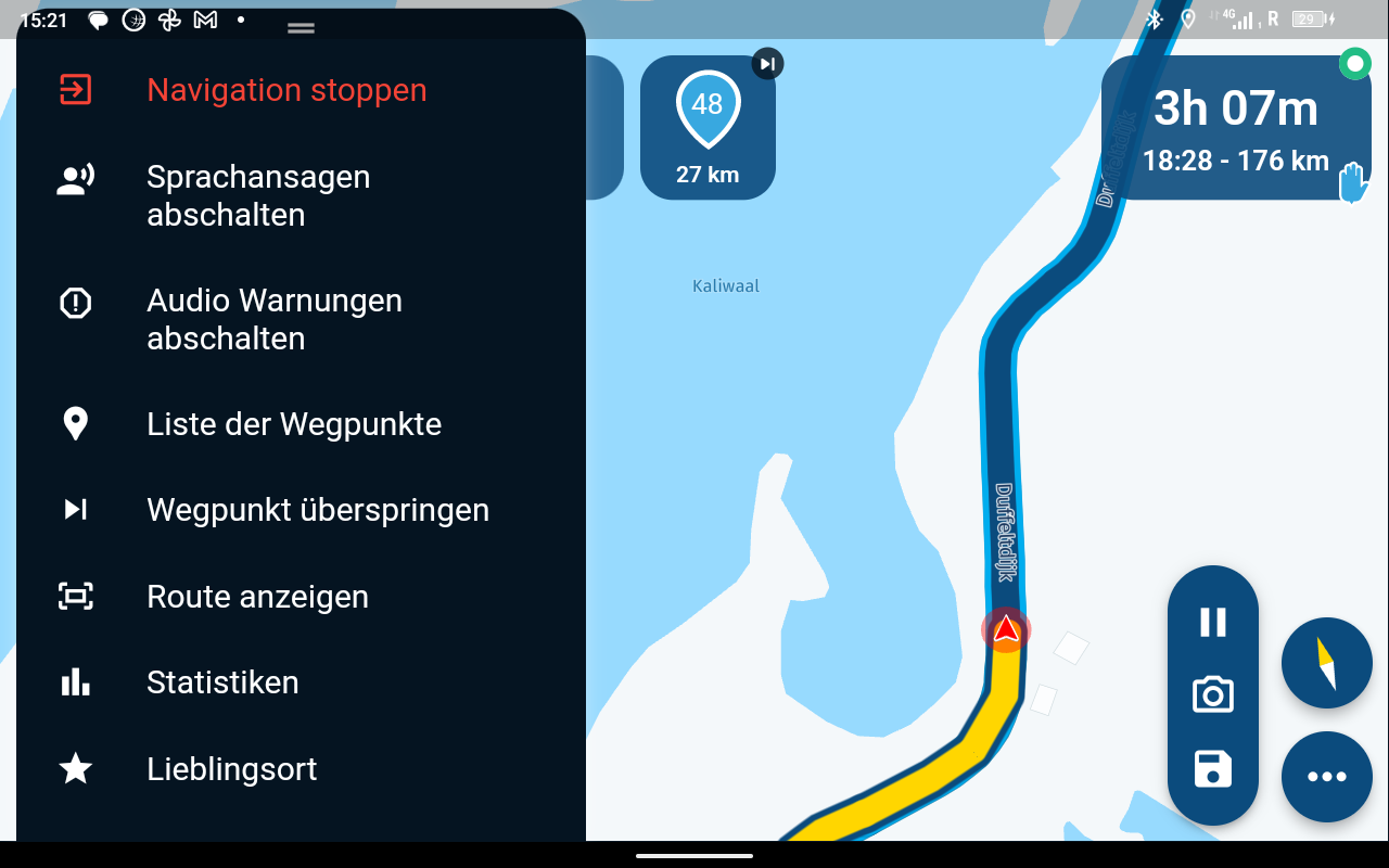
When you click on the three dots, to open the menu, you normally want to make changes e.g. switch off warnings.
Isn't a good Idea to close the menu after this and go back to the navigation screen?
At the moment, you need to click again on the dots to close this window.
@Jörgen that screenshot is either quite old or you are still some updates behind

I’m not in favour of the request as you might do more than one click and it would be annoying if the menu already closed. You can close the menu yourself by either clicking the dots or by tapping anywhere else on the map

-
@Jörgen that screenshot is either quite old or you are still some updates behind

I’m not in favour of the request as you might do more than one click and it would be annoying if the menu already closed. You can close the menu yourself by either clicking the dots or by tapping anywhere else on the map

@Corjan-Meijerink I like the menu as you say for the reasons you state. Works for me.
Sorry @Jörgen
-
Yes, screenshot is old, and I am up-to-date, just used to show it.
I am ok if the idea does not resonate.
Hello! It looks like you're interested in this conversation, but you don't have an account yet.
Getting fed up of having to scroll through the same posts each visit? When you register for an account, you'll always come back to exactly where you were before, and choose to be notified of new replies (either via email, or push notification). You'll also be able to save bookmarks and upvote posts to show your appreciation to other community members.
With your input, this post could be even better 💗
Register Login
